How Can Teams Ensure Consistent UI Across Browsers and Screen Sizes?

Preeti
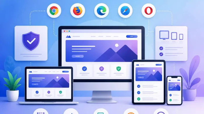
Table of Contents
Your app looks perfect in Chrome on a 1440p monitor. Then a user opens it in Firefox on a tablet, and the layout breaks. Buttons shift, fonts render inconsistently, and your polished interface suddenly looks unfinished. This is not a rare edge case. It is one of the most persistent challenges in modern frontend development. Achieving consistent UI across browsers and screens requires more than careful coding. It demands a system, a strategy, and the right tools working together from day one. This guide walks you through exactly how to build that.
Why UI Consistency Across Browsers and Screens Still Challenges Teams
Even in 2026, browser inconsistency remains one of the most frustrating realities for frontend teams. You might assume that modern browsers have converged enough to make this a solved problem. They have not. Chrome, Firefox, Safari, and Edge each have their own rendering engines, CSS interpretation quirks, and JavaScript behavior differences. Safari in particular still lags on certain CSS features and flexbox behaviors that other browsers handle without issue.
Beyond browsers, screen diversity has exploded. Your users access interfaces on phones, tablets, laptops, wide-format desktops, and even TV screens. Each combination of screen resolution, pixel density, and operating system introduces new variables. A layout that looks balanced at 1280px can collapse at 375px or stretch awkwardly at 2560px.
Teams also face a collaboration gap. Designers work with tools that abstract away browser behavior, developers carry out in one or two environments, and QA teams often test manually in limited configurations. As a result, inconsistencies slip through not because anyone was careless, but because the process had no structured way to catch them. The free cross-browser testing tools listed by Functionize or any other trustworthy source can give teams a starting point. Some of the tools listed there use AI-powered self-healing to automatically adapt tests when UI changes occur, significantly reducing the manual maintenance burden that typically slows teams down. But tools alone do not solve a process problem. You need both.
Build a Shared Foundation With Design Systems and Tokens
The most effective way to prevent UI inconsistency is to stop it at the source. A well-maintained design system gives your entire team a single source of truth for colors, typography, spacing, and component behavior. Instead of each developer interpreting a design file independently, everyone pulls from the same standardized library.
Design tokens take this a step further. A design token is a named variable that stores a UI value, such as a color hex, a font size, or a spacing unit. Tokens decouple the visual decision from the implementation. For example, instead of hardcoding #1A73E8 as a button color in five different stylesheets, you define it once as --color-primary and reference it everywhere. If that color changes, you update the token in one place, and the change flows across the entire product.
Why Component Libraries Reduce Cross-Browser Drift
A shared component library does more than save time. It standardizes how each UI element behaves and renders. Each component is built, tested, and documented once, then reused across teams. This means the same button, the same modal, and the same input field appear identically in every part of your product.
Component libraries also make browser-specific fixes easier to manage. If Safari mishandles a particular CSS property inside a dropdown, you fix it in the component definition, and every instance benefits from that fix immediately. Without a shared library, the same bug gets fixed in multiple places, or worse, only in some of them.
Governance and Versioning Keep the System Trustworthy
A design system only works if your team actually uses it and trusts it. That requires governance. Assign clear ownership so someone is responsible for reviewing contributions, deprecating old components, and documenting changes. Use semantic versioning so teams know exactly what changed between releases and can plan upgrades without surprise regressions.
Regular audits also matter. Schedule periodic reviews to identify components that have drifted from the system due to ad hoc overrides. Catching drift early is far less costly than discovering a fragmented UI after a major release.
Define Your Browser and Device Support Matrix Early
One of the most practical things your team can do is decide, before development begins, exactly which browsers and devices you support. This is your support matrix, and it should be a documented, team-wide agreement rather than an unspoken assumption.
Start with your analytics data. Look at which browsers and devices your actual users prefer. If only 0.4% of your traffic comes from Internet Explorer, supporting it is not worth the development overhead. On the other hand, if a significant portion of your users browses on iOS Safari, that platform deserves priority in your testing plan.
Setting Tier Levels for Supported Environments
Not all supported environments deserve the same level of attention. A tiered support model helps you allocate effort appropriately. Tier one environments receive full support, meaning every feature must work correctly and the layout must be pixel-accurate. Tier two environments receive functional support, meaning the UI might not look identical but must remain usable. Tier three environments receive no active support but should not produce catastrophic failures.
This tiered model is especially useful for older browser versions or niche devices. It sets clear expectations for designers, developers, and stakeholders without stretching your team thin.
Communicating the Matrix Across Teams
Your support matrix only works if everyone knows it exists and follows it. Document it in your project wiki or design system documentation. Reference it during sprint planning so developers know which environments to prioritize for new features. Share it with QA so testers focus their manual efforts on tier one environments first. A support matrix that lives only in someone's memory is no support matrix at all.
Combine Manual and Automated Cross-Browser Testing
No single testing method catches every UI inconsistency. Manual testing lets you evaluate nuanced interactions, edge cases, and overall feel, but it does not scale. Automated testing covers broad scenarios at speed but can miss subtle visual regressions that a human eye would catch immediately. The strongest testing strategy uses both.
For automated cross-browser testing, tools like Selenium, Playwright, and Cypress allow you to script user interactions and run them across multiple browser environments. You can simulate clicks, form submissions, and navigation flows, then assert that the expected UI state appears correctly. These tests are repeatable, fast, and easy to run in a CI/CD pipeline.
Visual Regression Testing for Pixel-Level Accuracy
Automated functional tests confirm that an element exists and a flow works, but they do not tell you whether the button shifted two pixels to the left or whether a font rendered incorrectly. Visual regression testing fills that gap. Tools in this category capture screenshots of your UI at defined checkpoints, then compare them against approved baseline images. If anything in the rendered output differs from the baseline, the test fails and flags the change for review.
Visual regression testing is particularly valuable after CSS refactors, dependency upgrades, or design token changes. These are the moments your interface is most vulnerable to unintended visual drift across browsers. Integrating this into your pipeline means no visual change goes unnoticed, regardless of which browser renders it.
Embed UI Consistency Checks Into Your CI/CD Pipeline
A testing strategy that only runs before a major release is far too late to be useful. By the time issues surface, code has accumulated, and tracing the source of a regression becomes difficult. Instead, move your UI consistency checks left, meaning earlier in the development process, by embedding them directly into your CI/CD pipeline.
Each time a developer opens a pull request, your pipeline should automatically trigger cross-browser tests across your tier one environments. This includes functional tests, accessibility checks, and visual regression comparisons. If any test fails, the pull request cannot be merged until the issue is resolved. This approach converts UI consistency from a final checklist item into a continuous quality standard.
Pipeline-based testing also creates an audit trail. Every build logs its test results, which means you can trace exactly when and where a visual regression was introduced. Over time, this data helps your team identify which components or code areas produce the most cross-browser issues. With that insight, you can focus refactoring efforts where they matter most and gradually reduce the volume of inconsistencies your pipeline needs to catch.
Conclusion
Consistent UI across browsers and screens does not happen by accident. It results from deliberate decisions made early, shared systems built for scale, and testing processes that run continuously rather than occasionally. Start by defining your support matrix, build on a solid design system with tokens, and pair manual testing with automated visual regression checks inside your CI/CD pipeline. Follow these steps, and your team will ship interfaces that look exactly as intended, wherever users choose to view them.
Comments